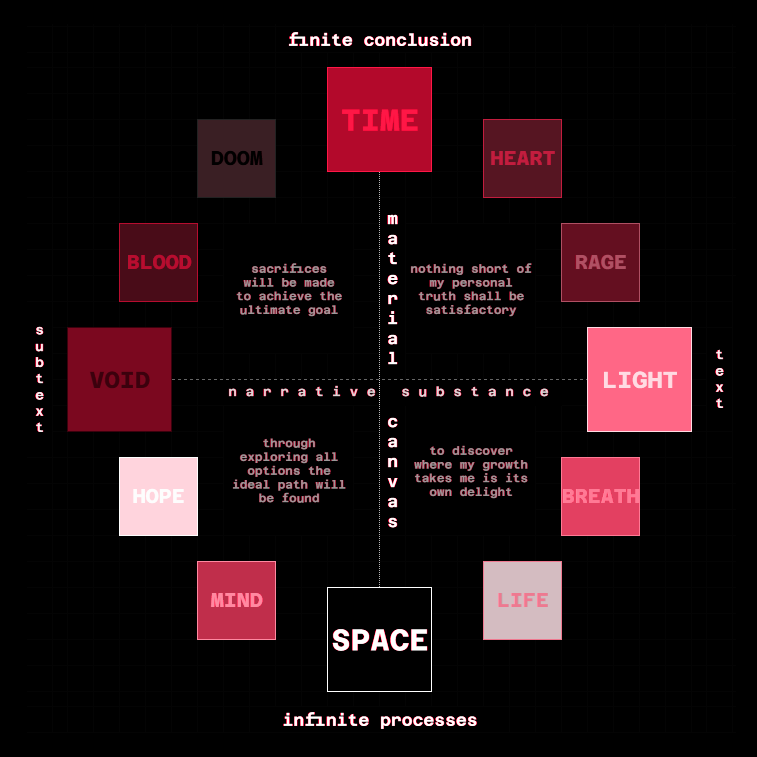
aspect wheel
modified homestuck aspect wheel with some commentary.
see below for ID and notes.

ID: A diagram depicting the twelve aspects of Homestuck in a circular formation. Order from the top, clockwise: TIME, HEART, RAGE, LIGHT, BREATH, LIFE, SPACE, MIND, HOPE, VOID, BLOOD, DOOM.
The diagram is split into four quadrants by a vertical and horizontal axis. On the vertical axis, the aspects of TIME and SPACE oppose each other as the aspects of the MATERIAL CANVAS. On the horizontal axis, the aspects of VOID and LIGHT oppose each other as the aspects of NARRATIVE SUBSTANCE.
The top left quadrant (BLOOD and DOOM) is labeled: 'sacrifices will be made to achieve the ultimate goal'. The top right quadrant (HEART and RAGE) is labeled: 'nothing short of my personal truth shall be satisfactory'. The bottom right quadrant (BREATH and LIFE) is labeled: 'to discover where my growth takes me is its own delight'. The bottom left quadrant (HOPE and MIND) is labeled: 'through exploring all options the ideal path will be found'. END OF TRANSCRIPT.
some remarks:
- while i enjoy the proximity of LIGHT/VOID to TIME/SPACE in the EZ aspect wheel, it is more satisfying to me to position LIGHT/VOID as the second cardinal axis.
- this means that BREATH/BLOOD are demoted from their cardinal positions. i can appreciate the more canon read of these as cardinal in the sense of containing plot & characters respectively. but my preference is for LIGHT/VOID.
- it is notable though that i do still see LIGHT as adjacent to TIME and VOID as adjacent to SPACE.
- speaking of TIME. it makes the most sense to me to put it in the midnight position. relating it to the concept of the doomsday clock & the saying one minute to midnight.
- LIGHT can then be seen as DAWN and VOID as DUSK. SPACE and VOID being in the positions of 6 and 9 respectively works with the fact that their symbols are visually similar.
- the general grouping of aspects remains similar: if you split the aspect wheel in two along the LIGHT/VOID axis, the aspects closer to TIME and SPACE are the same in my version as they are in the EZ version.